I’d like to discuss the endless search for form over functionalism and how design becomes more engaging with a goal to appreciate both. I love the layers of design and how mastering the process of a problem becomes the solution to the problem. Design transcends the solution entirely and relies solely on the conceptual notion that how we approach a problem will solve the problem. I’ve learned over the year that layers of design apply conceptual essence through shape, and text. Connotations and Denotations will be discussed also including anchoring the meaning or relaying it into a new meaning. The first layer of design then would be the composition or shape, layout of elements. The gird has proven to be an extremely useful tool for composing graphic elements on a page. The second would be the use of typography onto the page with great relation and respect to the underlying composition. The third would be the meaning of the image and the message trying to communicate (sometimes if not often this is discovered in preliminary idea searching stage). At last we come to the four layer of design and that is with style. Style of the color, tone of an image, the background, texture, the extras that leave out no meaning and are not arbitrary to the overall composition. With all these layers singled out and studied somewhat independently they become more visually understood. I’ve learned that great design uses these layers to bring new and useful as well as exciting information to the piece, but they work independently then when combine communicate a greater message of clarity and great cohesiveness. In conclusion my future goals of education at the art institute will be to fully develop these design skill to Clean up a dirty design world as Massimo Vingelli would say.(insert quote) CONTRACT whole cow how could I almost forget about this one. Contrast is the biggest most important part when determining the relationship graphic elements share with each other when composed together. Contrast in size of text, tone of image, and proximity in space. Contrast is the glue of the design, to much can make a mess of the whole thing not enough it will all fall apart. With the perfect amount however the simple nature of a well-constructed message could be the candidate for a timeless design.
Showing posts with label Viscom II. Show all posts
Showing posts with label Viscom II. Show all posts
5.07.2010
4.22.2010
Exhibit Titles
Labels:
Viscom II
I did some mind mapping to explore possible titles Ideas for my project. The direction I attempted first was from a more moral or ethic conflict on our world today. Some of the compositions I had for monday started revealing this kind of theme and I decide to explore it a little more. The second set of titles is for an organized crime theme. I feel like my icons and composition can fit in well to this idea with minor alterations. This theme also relates more to my initial ideas of the project, and can be a more visible museum exhibit to me.
Titles A:
Inhumane Affect
Culturural Apathy
Inhumane Conflict
What harms us all
Interminable Conflicts
Eternal Conflict
Amoral World
World Morality Explored
Morality
Evil has no shadow
Human Moral Conflict
Immoral on Earth
Title B:
Organized Crime World
Crime World
Criminal Enterprise
Cultural Villains
Amoral Villains
Amoral Criminals
Criminal Morality
I like Criminal Enterprise, and Amoral Criminals something with crime history and organized crime is what I will approach as a final decision.
4.09.2010
Linear Progression of Information Graphic
Labels:
Viscom II


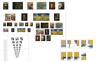

Here is my development process of the information graphics I have designed for the magazine spread.
I split it up into 4 parts ;
1) Analogue study:
(prototyping) with a few thumbnail sketch ideas
2) From analogue to digital"
this step was about getting all the information on the digital format, and making sure to have all the statistics correct.
3) Formal element study: I experimented with the scale of my icons, the paintings, and the pattern used to represents the necessary quantities.
4) Digital Refinement:
This is the final step making fine tune adjustments for spread application, color corrections, and craft issues. I decided to use my first choices in color palettes in this step, because I felt the colors work well over the entire spread. The first colors were a mid-tone gray with a rich burgundy then I switched it to a more mid-night purple. The burgundy has better contrast, and adds a more dramatic statement to my content.
4.07.2010
Latest Infograph refinement
Labels:
Viscom II

This is the most up to date iteration of my info graph. The article with continue on the bottom space of the graph.
3.22.2010
Content Research
Labels:
Viscom II
Most of my research derives from art crimes. The research I have done has proven that art crime statistics are lacking in recorded data. I did find some good information and facts, but I feel I need to find more for my icons leading up to the act of committing the crime. The flashlight and lipstick need to be tied back into the set.
Works Cited
Art Crime Facts. 2009. ARCA. 20 Mar. 2010.
Blurglary -crime in the united states 2006. 01 Sept. 2007. Federal Bureau of Investigation. 20 Mar. 2010.
Durney, Mark. Art Theft Central. Ed. Durney Mark. 10 Mar. 2009. ARCA. 20 Mar. 2010.
Michigan State University Library- criminal justice resources. 04 Mar. 2009. Justice research and statistics association. 20 Mar. 2010.
Works Cited
Art Crime Facts. 2009. ARCA. 20 Mar. 2010
Blurglary -crime in the united states 2006. 01 Sept. 2007. Federal Bureau of Investigation. 20 Mar. 2010
Durney, Mark. Art Theft Central. Ed. Durney Mark. 10 Mar. 2009. ARCA. 20 Mar. 2010
Michigan State University Library- criminal justice resources. 04 Mar. 2009. Justice research and statistics association. 20 Mar. 2010
3.11.2010
Icon Process Picture Frame
Labels:
Viscom II

The Picture frame has been difficult for me to develop and am still not satisfied with the results. I've explored a couple different ideas, and all have fallen short. The rules I have developed for my set do not work well with the flat orientation of the frame. The cropping of the icon puts the positive/negative balance off and makes it look awkward. It seems what I have will do for now, and I will have to explore and alternative approach to communicate the picture frame better.
Icon Color Set
Labels:
Viscom II


These is the final color set that I have developed thus far. I've been working on the craft and clarity of the icons themselves, and will continue to improve the overall quality throughout the remainder of the project. The color for the icons is a mid-night blue/purple and a gray. The blue tone represents the night at which the crime takes place, and the gray is signifier of the gun being used to commit the crime. I feel the two colors work well to represent the high class nature of the crime, but I will continue further exploration to find the right match of color. This project has taught me a lot about paying close attention to the rules that one discovers through exploration and applying them strictly to achieve a visually interesting system.
3.05.2010
Linear Process
Labels:
Viscom II

These is the linear progression of a pistol icon that I developed for my story "The Art Heist". From analog drawings to vector, and then refinement of scale position and contrast.
Icon Color Study
Labels:
Viscom II


Here is an up to date idea of what I'm working on with my color study for the icons. After looking at the palette I set for my self I think I'll be going back and reworking some of the colors. I feel they are a little blain and some don't relate to well with my story. I feel the gold and the red is a successful color combination, because it represents money, power, and lust. I do still need to explore more colors to find the right ones for the job.
2.19.2010
F & S
Labels:
Viscom II
These logos were designed by Dave Werner and found them to be appealing. The web site is designed very nice, and it is a great example how Dave's process was influenced into creating the logos for each situation. He is website is here , check it out he has some cool stuff inside.
or here : http://okaydave.com/
2.01.2010


Story Process
Labels:
Viscom II


This are the images I have gathered for the two word story. I feel a few of these will work really well to unfold my story. I might investigate more objects unique to my story if some turn out not to be as beneficial like the rock key hider. The rock key hider is lack visual interest, and will probably not be used, but will be kept in the mix for now. The title is still a work in progress, and will present it self as I dive deeper into the project.
Work Title
Run on Life
Can't be Caught
Stealing Art
(any suggestion)
1.28.2010
Project 1 Story Ideas
Labels:
Viscom II
Story 1
Working TitleA new Home
Run on Life
On The Run
Life Long Run
Objects:
Bloody silk blouse
Lip stick
cigarettes
Duffel bag
Pistol
tuxedo
limo
brown package
palm tree
priceless picture frame
House Key
Rope
flashlight
Story 2
Working Title:
Bob's Lucky Day
Washed up shore
One Luck Day
Objects:
Wheelchair
Public bus
Hospital gown
Priceless bracelet
Scarf
Toolbox
Umbrella
Suitcase
Pack of Gum
Sandals
Sun glasses
Hotel key
Shark tooth
Scuba knife
Subscribe to:
Comments (Atom)