10.05.2010
Three Ways The Brain Creates Meaning
I found this video while researching for content for my Jakob Trollback. Interesting that the video is from TED and Trollback+company puts together motion graphics for the event. I felt like this is worth sharing good insight on how we interpret meaning on a fundamental level.

Jakob Trollback reference material
Labels:
Narrative
Here are a few links to the source of information for my Jakob Trollback presentation
Instrumental design after 10 years - BoardsTrollback Home Page - Features work from firm, and a short little bio about the company.
10.04.2010
Narrative Combined Detail
Labels:
Narrative
This is a combination of the two detail narrative about Raven Wolf, and the start of his label "Pug Dog Records." The images make suggestions towards the genre of music being played, and the audio bit tells the story of his record company.
Raven Wolf Narrative from Bryan Baumgart on Vimeo.
9.27.2010
Package Research
For this project we are going to be discovering the different modes of appeal in design. From todays lecture I understand a little more about the differences between Ethos, Logos, and Pathos. Ethos uses creditability trustworthiness, and status to reinforce the message or quality of a product. Often times you will see authoritative figures endorsing a product. Logos is more logical mode of appeal relying on factual information to produce reason or understanding of the benefits. Pathos appeals to our emotional side bringing a memory to mind within a products connotations is a good example of capture the Audience.
The three products I will be using as tools for discovering modes of appeal are; Morton Kosher Salt, Kraft Macaroni & Cheese, and Post Honey Bunches of Oats. The salt design is using Ethos as a mode of appeal for the audience. It relies on the vegetables on the front to give credibility to the health benefits of there salt to other, also the Swastika on the front of the box is validating its authenticity. The Cereal design initial seemed to be Logos, I felt the call outs of nutritional values on the box being very factual seemed to appeal to reason. Through further discovering in class we decided that the Cereal was in fact pathos. The rendering method of the honey comb on the front of the box has a animated characteristic that appeals to our emotions, and with the cropping of the spoon with sun rays shining through the background suggest bright sunny mornings. The third product Mac N Cheese seemed to be pathos to me. With the spoon full of mac n cheese on the front and using color to draw the audience in, then presenting Whole Grain with 50% above. We determined in class this to be more logos, and I agree with the suggestions of amount of whole grain.
The Audience will vary from each product I have chose. The Salt being Kosher I think appeals to an audiences that investigates more of there food chose and desired taste. The call out on the product "Great for Gourmet Cooking" suggest its made for chefs and restaurant quality food. For The Mac n Cheese the audience will be directed primary to parents , the provider, and with the Whole grain advertisement is for parents that or nutritionally conscious. The Kraft logo and choice of colors appeal to children more to suggest how good the food is. The Cereal will be for a be for people more caring about there food consumption, and rely on breakfast to get nutrients for the day. I'm going to think about the audience more to be able to fully understand my target groups.
The three products I will be using as tools for discovering modes of appeal are; Morton Kosher Salt, Kraft Macaroni & Cheese, and Post Honey Bunches of Oats. The salt design is using Ethos as a mode of appeal for the audience. It relies on the vegetables on the front to give credibility to the health benefits of there salt to other, also the Swastika on the front of the box is validating its authenticity. The Cereal design initial seemed to be Logos, I felt the call outs of nutritional values on the box being very factual seemed to appeal to reason. Through further discovering in class we decided that the Cereal was in fact pathos. The rendering method of the honey comb on the front of the box has a animated characteristic that appeals to our emotions, and with the cropping of the spoon with sun rays shining through the background suggest bright sunny mornings. The third product Mac N Cheese seemed to be pathos to me. With the spoon full of mac n cheese on the front and using color to draw the audience in, then presenting Whole Grain with 50% above. We determined in class this to be more logos, and I agree with the suggestions of amount of whole grain.
The Audience will vary from each product I have chose. The Salt being Kosher I think appeals to an audiences that investigates more of there food chose and desired taste. The call out on the product "Great for Gourmet Cooking" suggest its made for chefs and restaurant quality food. For The Mac n Cheese the audience will be directed primary to parents , the provider, and with the Whole grain advertisement is for parents that or nutritionally conscious. The Kraft logo and choice of colors appeal to children more to suggest how good the food is. The Cereal will be for a be for people more caring about there food consumption, and rely on breakfast to get nutrients for the day. I'm going to think about the audience more to be able to fully understand my target groups.
Folly Poster Process
Labels:
Visual Language
The bad plus found its spot in the new era of jazz that will change how we think about jazz. From the research I felt they were trying to introduce a new feeling or interpurtation to there music. Using traditional style jazz instruments with a very "Rock" free style approach.


9.22.2010
Type 3 Inspiration
Labels:
Type 3
this is an interesting take on a mailer campaign.
Direct Mailing Typotron on the Behance Network
Direct Mailing Typotron on the Behance Network
9.15.2010
NA_Prj3_Detail Narrative

Raven
 Wolf Jennings is a spiritual jazz musicians that I met at the river market. He plays every Sunday from 6am to 2 pm before heading off to his next gig. I am creating a brand identity for his company Pug Dog records, and telling his story. What I have learned thus far from the art of communication, is the separation between a story and the narrative. The story is the content, or the series of events being told, the narrative is how it is being told. Raven Wolf comes from old roots of traditional jazz so I have decide to add different textures and tones to make his story seem more authentic, and vintage. Also how the story is introduced effects the outcome of the emtion being portrayed.
8.30.2010
Narritive
Labels:
Narrative
For my narritive top I have chose to compose a piece about Busking - Street performance or busking is the practice of performing in public places for money. People engaging in this practice are called street performers, buskers, street musicians, minstrels, or troubadours. (Wiki Defined). I've seen many different aspects of this culture through the events put on in different cities, and would like to explore what this part of our society is about. My first reaction was to create a brand identity, and was a little unclear as to what I would be branding. Whether is was busking as a group or an individual street performer. The audience would be more captivated if it were about busking as a culture instead of the individual, so my focus will be on the group. Through my research I discovered that Kansas City Missouri was trying to put a ban on busking, and greatly reduce the time and location that buskers could preform. This happened around 2007, and would made a great information narrative, but due to the time frame I have chose something a little more current.
I have decided to stick with my initial decision of creating a brand identity narrative, and have decided to focus on the Lawrence busker festival held annual in downtown Lawrence. This festival is just completed its third year, and is still fairly new giving me a good opportunity to create a brand narrative for the event.
Here is the site I will be using as a reference point for my remaining research Lawrence Busker Festival There is great photography here, and insight as to what my target audience is going to be.
I have decided to stick with my initial decision of creating a brand identity narrative, and have decided to focus on the Lawrence busker festival held annual in downtown Lawrence. This festival is just completed its third year, and is still fairly new giving me a good opportunity to create a brand narrative for the event.
Here is the site I will be using as a reference point for my remaining research Lawrence Busker Festival There is great photography here, and insight as to what my target audience is going to be.
5.07.2010
Final Review (thoughts)
Labels:
Viscom II
I’d like to discuss the endless search for form over functionalism and how design becomes more engaging with a goal to appreciate both. I love the layers of design and how mastering the process of a problem becomes the solution to the problem. Design transcends the solution entirely and relies solely on the conceptual notion that how we approach a problem will solve the problem. I’ve learned over the year that layers of design apply conceptual essence through shape, and text. Connotations and Denotations will be discussed also including anchoring the meaning or relaying it into a new meaning. The first layer of design then would be the composition or shape, layout of elements. The gird has proven to be an extremely useful tool for composing graphic elements on a page. The second would be the use of typography onto the page with great relation and respect to the underlying composition. The third would be the meaning of the image and the message trying to communicate (sometimes if not often this is discovered in preliminary idea searching stage). At last we come to the four layer of design and that is with style. Style of the color, tone of an image, the background, texture, the extras that leave out no meaning and are not arbitrary to the overall composition. With all these layers singled out and studied somewhat independently they become more visually understood. I’ve learned that great design uses these layers to bring new and useful as well as exciting information to the piece, but they work independently then when combine communicate a greater message of clarity and great cohesiveness. In conclusion my future goals of education at the art institute will be to fully develop these design skill to Clean up a dirty design world as Massimo Vingelli would say.(insert quote) CONTRACT whole cow how could I almost forget about this one. Contrast is the biggest most important part when determining the relationship graphic elements share with each other when composed together. Contrast in size of text, tone of image, and proximity in space. Contrast is the glue of the design, to much can make a mess of the whole thing not enough it will all fall apart. With the perfect amount however the simple nature of a well-constructed message could be the candidate for a timeless design.
4.28.2010
Poster image ideas
Labels:
Type II


Took three photographs and complied them into a panorama, and then used photoshop and layers to make this HDR effect.
Update: I'm starting to really appreciate digital photography manipulation, and photoshop is surprising me more and more. These next version I created the panorama myself and clipped it into separate rectangles. I was just goofing with the colors, and developed an interesting series. Might try to incorporate this idea into my final poster design if it fits, but definitely breaking the image apart I feel it gives the image a more dynamic quality.

4.22.2010
Exhibit Titles
Labels:
Viscom II
I did some mind mapping to explore possible titles Ideas for my project. The direction I attempted first was from a more moral or ethic conflict on our world today. Some of the compositions I had for monday started revealing this kind of theme and I decide to explore it a little more. The second set of titles is for an organized crime theme. I feel like my icons and composition can fit in well to this idea with minor alterations. This theme also relates more to my initial ideas of the project, and can be a more visible museum exhibit to me.
Titles A:
Inhumane Affect
Culturural Apathy
Inhumane Conflict
What harms us all
Interminable Conflicts
Eternal Conflict
Amoral World
World Morality Explored
Morality
Evil has no shadow
Human Moral Conflict
Immoral on Earth
Title B:
Organized Crime World
Crime World
Criminal Enterprise
Cultural Villains
Amoral Villains
Amoral Criminals
Criminal Morality
I like Criminal Enterprise, and Amoral Criminals something with crime history and organized crime is what I will approach as a final decision.
4.14.2010
Book cover Process
Labels:
Image
The books I chose to design covers for and incoperate in a series are:
The Art of the Steal- Frank W. Abagnale
Concealed Carry- Massad Ayoob
Appearances; The Art of Class- G Keith Evans
Museum of the Missing - Simon Houpt
I chose these books for a series, because I felt it would make a nice set to play off the perspective of a thief. These books would provide insight into how the best cons, and thefts would work, which gun is best for the job, how to dress nice to fit the part, and the history of the crime. Not sure why I went in these direction it feels a little off balance since I'm seeking a career in the art profession. The synapses are pulled from Amazon, and are as follows;
artAppearances: The Art Of Class (Paperback)
~ G. Keith Evans (Author)
Editorial Reviews
Product Description
Class- that familiar measure of sophistication- exists not as a gauge of wealth and achievement but as a byproduct of subtle refinement. Minute details, commonly overlooked by even the most well-heeled, can distinctly set an individual apart from the faceless persona of the middle-class. Appearances addresses these subtle nuances, analyzing finespun details ranging from the common consideration of etiquette to the societal impact of world travel.
The Art of the Steal: How to Protect Yourself and Your Business from Fraud, America's #1 Crime (Paperback)
Editorial Reviews
Amazon.com Review
Author Frank W. Abagnale knows something about fraud--he once committed it for a living. "Through my various hustles, I passed something like $2.5 million worth of checks, a blizzard of paper that I scattered in earnest throughout all fifty states and twenty-six countries, all before I was legally allowed to drink," he writes. "I was proficient enough at cashing fraudulent checks that I earned the distinction of becoming one of the most hunted criminals by the FBI." Abagnale was ultimately caught, and he served prison sentences in France, Sweden, and the United States. In the 25 years since his release, Abagnale (who also wrote Catch Me If You Can) has become a leading consultant on fraud prevention.
"I'm still a con artist. I'm just putting down a positive con these days, as opposed to the negative con I used in the past," he explains. "I've applied the same relentless attention to working on stopping fraud that I once applied to perpetrating fraud." His expertise comes in handy: businesses lose an estimated $400 billion each year to fraud. The stories Abagnale tells in The Art of the Steal provide fascinating glimpses of a criminal underworld. He describes "shoulder surfers" who rip off bank customers at ATMs by videotaping their fingers as they enter PIN numbers, retrieving receipts from wastebaskets, and then creating fake credit cards--all rather inexpensively. Whole sections of the book almost read like a how-to manual for aspiring thieves, though Abagnale has other motives. Throughout, he offers sensible advice on how to foil the con artists. Much of this is common sense (cut up credit cards when they expire), but some of his suggestions aren't so obvious. He warns readers not to write checks to the "IRS," for instance: "Envelopes to the IRS are common targets because of where they're going." Instead, checks should be made out to the "Internal Revenue Service," because criminals can turn the "I" of "IRS" into an "M," and turn a tax payment into a gift for "MRS." Smith. The chapter on the emerging problem of identity theft--with its tips on how to keep Social Security numbers private--is especially helpful. In all, The Art of the Steal is captivating and useful. --John Miller --This text refers to an out of print or unavailable edition of this title.
The Gun Digest Book Of Concealed Carry (Paperback)
Editorial Reviews
Product Description
In addition to tactical aspects of self-defense, practical information like choosing the right firearm and ammunition, used gun purchases, and all legal aspects of self-defense with a gun are also extensively covered in this complete and authoritative look at concealed carry.
About the Author
Massad Ayoob is one of the pre-eminent fighting handgun trainers in the world. He operates the Lethal Force Institute, which trains both U.S. and international clients. His methods of reflexive, high speed yet accurate shooting has been adopted by the U.S. army as part of its standard pistol-training course. Massad has written many books for Krause Publications, including Combat Handgunnery, The Gun Digest Book of Sig-Sauer, and The Gun Digest Book of Beretta Pistols.
4.09.2010
Linear Progression of Information Graphic
Labels:
Viscom II


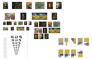

Here is my development process of the information graphics I have designed for the magazine spread.
I split it up into 4 parts ;
1) Analogue study:
(prototyping) with a few thumbnail sketch ideas
2) From analogue to digital"
this step was about getting all the information on the digital format, and making sure to have all the statistics correct.
3) Formal element study: I experimented with the scale of my icons, the paintings, and the pattern used to represents the necessary quantities.
4) Digital Refinement:
This is the final step making fine tune adjustments for spread application, color corrections, and craft issues. I decided to use my first choices in color palettes in this step, because I felt the colors work well over the entire spread. The first colors were a mid-tone gray with a rich burgundy then I switched it to a more mid-night purple. The burgundy has better contrast, and adds a more dramatic statement to my content.
4.07.2010
Latest Infograph refinement
Labels:
Viscom II

This is the most up to date iteration of my info graph. The article with continue on the bottom space of the graph.
3.22.2010
content Research
Labels:
Type II
http://artcrime.info/facts.htm
http://staff.lib.msu.edu/harris23/crimjust/stats.htm#international
http://arttheftcentral.blogspot.com/2009/03/surveying-art-thefts-in-news.html
http://staff.lib.msu.edu/harris23/crimjust/stats.htm#international
http://arttheftcentral.blogspot.com/2009/03/surveying-art-thefts-in-news.html
Content Research
Labels:
Viscom II
Most of my research derives from art crimes. The research I have done has proven that art crime statistics are lacking in recorded data. I did find some good information and facts, but I feel I need to find more for my icons leading up to the act of committing the crime. The flashlight and lipstick need to be tied back into the set.
Works Cited
Art Crime Facts. 2009. ARCA. 20 Mar. 2010.
Blurglary -crime in the united states 2006. 01 Sept. 2007. Federal Bureau of Investigation. 20 Mar. 2010.
Durney, Mark. Art Theft Central. Ed. Durney Mark. 10 Mar. 2009. ARCA. 20 Mar. 2010.
Michigan State University Library- criminal justice resources. 04 Mar. 2009. Justice research and statistics association. 20 Mar. 2010.
Works Cited
Art Crime Facts. 2009. ARCA. 20 Mar. 2010
Blurglary -crime in the united states 2006. 01 Sept. 2007. Federal Bureau of Investigation. 20 Mar. 2010
Durney, Mark. Art Theft Central. Ed. Durney Mark. 10 Mar. 2009. ARCA. 20 Mar. 2010
Michigan State University Library- criminal justice resources. 04 Mar. 2009. Justice research and statistics association. 20 Mar. 2010
3.12.2010
Type Expressive weather Motion
The flash videos are always fun and frustrating. After uploading the video I noticed my images are way to big and are causing the video to stream choppy I'm going to try to fix it, but have to wait for vimeo to upload again.
Weather Intro from Bryan Baumgart on Vimeo.
Type Expressive weather


Here is the final product for this typography design. The biggest thing I learned from this project is the level of difficultly involved in integrating digital type with organic or analog expressive type. It seems hard to combine the two without making the digital type feel pasted on. This was a good project to explore several applications of type. I feel that my ideas were strong and my approach was working well, but the amount of time I devoted to this project was poor. In the future I will be determined to balance out the structure of the projects better.
Seven Deadly Sins Process
Labels:
Image


For the seven deadly sins I had a variety of ideas that I wanted to explore, and through sketching and brainstorming was able to narrow it down to a series of miniatures. Originally I was thinking of shooting a person committing a sin in an everyday routine ( wake up snooze, eat to much breakfast, and road rage) to make this more interesting I thought of having the person committing the act also watching in the scene. The photography would have to be altered and wouldn't have been successful otherwise. The second idea and probably my strongest was to attend a college party and catch people in the act of committing the sin. The series of sketches below were how I explored this approach ; gluttony would be a person passed out on a couch and beer cans all around, lust would have clothes placed around a room and two people covered in a bed. Unfortunately I became ill and was unable to shoot this idea, so I finally went with my third idea of using extreme proportion change to exaggerate the sins. I feel the series turned out well. The sins are communicated clearly, and have a interesting appeal. I do feel there could be a little more relationship and consideration between the pictures and the arrangement within the book.
3.11.2010
Icon Process Picture Frame
Labels:
Viscom II

The Picture frame has been difficult for me to develop and am still not satisfied with the results. I've explored a couple different ideas, and all have fallen short. The rules I have developed for my set do not work well with the flat orientation of the frame. The cropping of the icon puts the positive/negative balance off and makes it look awkward. It seems what I have will do for now, and I will have to explore and alternative approach to communicate the picture frame better.
Subscribe to:
Posts (Atom)